Web Accessibility Guidelines
Southern State's Web Accessibility Guidelines are based on the internationally accepted Web Content Accessibility Guidelines AA standards (WCAG 2.0) published by the W3C World Wide Web Consortium (W3C).
Best Practices
SSCC is committed to providing exceptional learning opportunities to all students, including those with disabilities. Faculty are required by law to make their online course content accessible to all students.
Adhering to Web Accessibility Guidelines and Best Practices while developing your online course content will benefit all students including those with visual, hearing, mobility and learning disabilities.
Browse Guidelines
Click the links below to expand or collapse the guideline definitions.
Headings
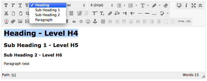
Use properly formatted headings to structure the page. Headings help organize your content, making it easier for everyone to read. Headings are a primary way to navigate pages using screen reading software.
Tips for proper use of headings in Canvas
- H1 is already provided to identify the page in Canvas.
- H2 headings are used to delineate major sections of a page.
- H3 headings are used as the title of content items or key content elements on a page.

- Use headings in the order of h5 - H6
- Heading (equivalent to h5 heading level)
- Sub-heading 1 (equivalent to H5 heading level)
- Sub-heading-2 (equivalent to H6 heading level)
- Don't skip headings going down, skipping headings going up is okay
- Mark up anything that visually looks like a heading to create good document structure
Lists
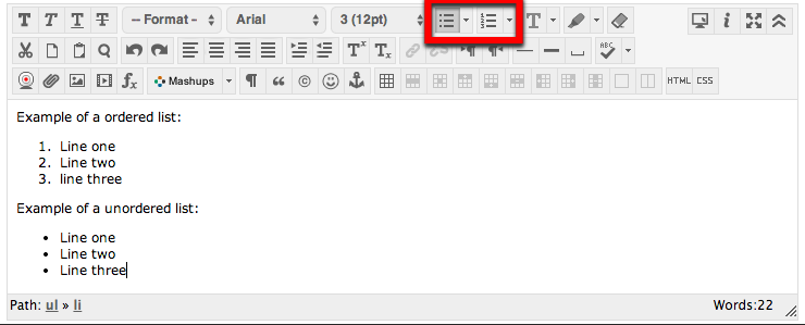
Format lists as proper lists. When typing a list, use the proper tools to make a list. Properly formatted numbered lists and bulleted lists are accessible.
Select the content you want to make into a list. Then on the toolbar, click on the Unordered List icon if the order doesn't matter or select Ordered List from the drop-down menu if the order does matter.

Example of a ordered list:
- Line one
- Line two
- line three
Example of a unordered list:
- Line one
- Line two
- Line three
Links
Write meaningful link text. Links embedded in text should describe the link's destination. Links should also be in a logical order on the page to help users navigate by tabbing using the keyboard.

Link Titles
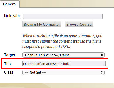
If you have a link that isn't self-descriptive, or the link destination could benefit from being explained in more detail, you can add information to a link using the title attribute.

Tables
Create tables with column and/or row headers, and ensure a proper reading order. Table headers are essential to understanding how the information is organized. Reading Order in a Table is Important. Screen readers read tables from left to right, top to bottom, one cell at a time (& only once). If cells are split or merged, check the reading order.
Use of Color
Use sufficient color contrast. Don't use color alone to convey meaning. Without sufficient color contrast between font and background, people who are color blind and low vision will not benefit from the information. And using color alone to convey meaning will leave those who are color blind or blind unable to interpret the meaning.
Keyboard Accessibility
Ensure that any action that uses a mouse, can also be completed using only the keyboard. Mobility and visual disabilities often prevent people from using a mouse. If content is not keyboard accessible, it will limit many people's opportunities to learn from the content.
Image ALT Text
Provide alternative (Alt) text descriptions for images. Alt text is read by a screen reader. It should adequately describe what is being displayed and why it's important. This allows screen reader users to benefit from the information being conveyed by the image, even if they cannot see it.
Navigation
Design clear and consistent navigation. Clear and consistent navigation in your course will allow students to focus on your content rather than on how to find it.
Blinking Limit
Eliminate or limit blinking / flashing content to 3 seconds. Blinking content is not only distracting it can cause seizures in persons with a photosensitive disorder.
Forms
Label form fields and buttons clearly, and ensure a proper reading order in a form. Reading order of a form is important. Using the tab key, your cursor should follow through the form in the same order it is intended to be completed. Labeling buttons and form fields is important. A screen reader will identify the field by reading the label. It should adequately describe what should be filled in.
Closed Caption Video
Provide captions or transcripts for video that you produce if it will be used for more than one term. Video captions benefit everyone. Captions are essential for deaf and hard of hearing viewers. They also assist non-native English speakers who can read along while listening. (Note: Videos should have a keyboard accessible player.)
Transcribe Audio
Provide a transcript for audio that you or SSCC produced, if it will be used for more than one term. Audio transcripts benefit everyone. They are essential for the deaf and hard of hearing and they assist non-native English speakers who can read along while listening.
Required Software
Require only accessible software & applications. Inaccessible software and applications will shut students with disabilities out. Ask the software developer for a VPAT (Voluntary Product Accessibility Template) to help determine the product's accessibility.
Math and Science
Write math and science equations accessibly. Use an accessible equation editor to write scientific notations, equations and formulas. This will allow screen readers to read equations properly.
Optional Materials
Optional materials must include a balance of accessible options.


